BRANDING EVOLUTION CONCEPT
1. Initial Inspiration & Core Concept
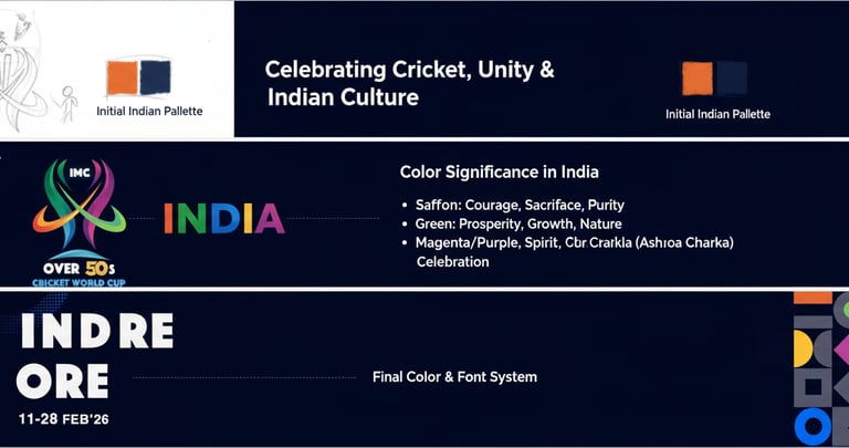
The design begins with the idea of celebrating both cricket and Indian culture, focusing on movement, unity, and the vibrancy of the nation. The "Over 50s" aspect brings in a sense of experience and timeless passion for the sport. The idea for the logo was to create a dynamic mark that represents the energy of cricket (ball, stumps, bat movement) combined with a sense of unity and celebration.
Initial Indian Palette: The core colors were drawn from the Indian flag and its rich cultural heritage:
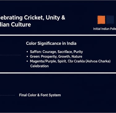
Orange/Saffron: Represents courage, sacrifice, and purity.
Navy Blue: A modern take on the Ashoka Chakra's blue, signifying truth, peace, and progress.
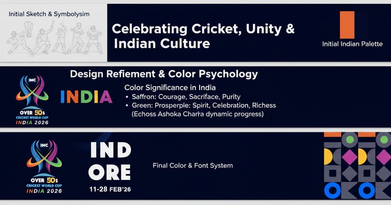
The initial sketch evolved into a more abstract and fluid design, combining elements that subtly hint at cricket while being a celebratory symbol. The color palette was expanded to reflect India's diverse and vibrant spirit.
Logo Refinement: The intertwined ribbons represent:
Unity & Connection: Different teams coming together.
Movement & Dynamism: The energy of cricket.
Trophy/Cup Shape: A subtle nod to the World Cup.
"IMC" Integration: Placed strategically to signify the organizing body.
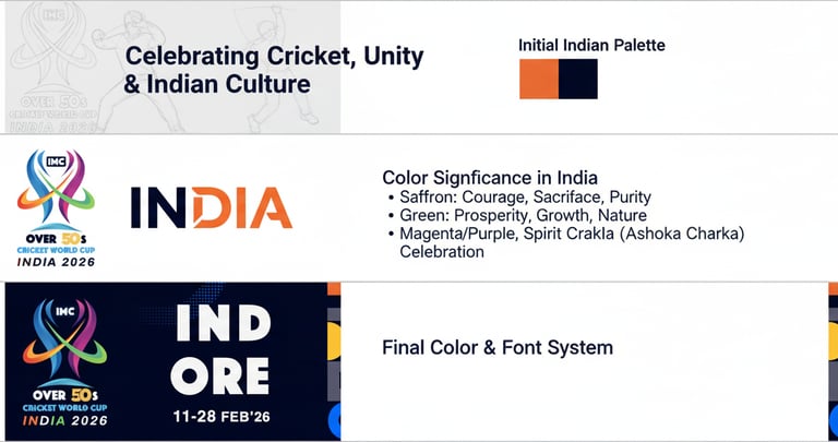
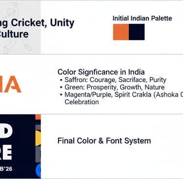
2. Design Refinement & Color Psychology
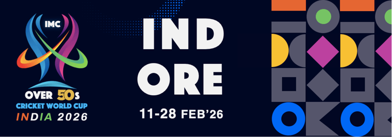
3. Final Brand Identity (2026)
The refined logo, expanded color palette, and chosen typography come together to form the final brand identity for the "IMC Over 50's Cricket World Cup India 2026."
Final Logo Integration: The logo is placed prominently, symbolizing the event's core. The "INDIA 2026" text uses a vibrant saffron to link back to the national identity.
Event Information (Indore & Dates):
Font: A strong, clear, and modern sans-serif font like "INDORE" is chosen for key event information. Its clean lines ensure maximum readability, especially at a distance. The all-caps format projects importance and directness.
Date Format: A concise date format (11-28 FEB'26) ensures clarity.
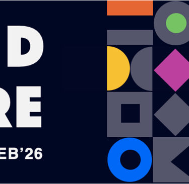
Geometric Pattern: The vibrant geometric pattern on the right side of the banner is an abstraction of Indian artistry and textile designs, bringing in a modern yet culturally rooted visual element.
Colors in Pattern: The pattern utilizes the expanded brand colors (green, yellow, purple, blue, orange) to maintain consistency and add visual interest, reflecting the joyful and diverse spirit of India.
This template aims to showcase the journey from initial concept to a cohesive brand identity, highlighting how each element contributes to a meaningful and visually appealing representation of the IMC Over 50's Cricket World Cup in India.
Terms and Conditions
© 2025. All Rights Reserved
Privacy Policy
Code of Conduct
DOs & DONT's
IMC Over 50s CWC